Having Identical Building Blocks Between Designers and Developers Shrinks the Gap Between Them

For a long time, we have been making award-winning components that have saved a gazillion programming hours for developers. But why not push some more boundaries? Why not also impact other members of the software development team—designers, QAs, product and business stakeholders?
One at a time, let’s start with the designers. We have been cooking two major things lately.
Telerik & Kendo UI Design Kits for Figma
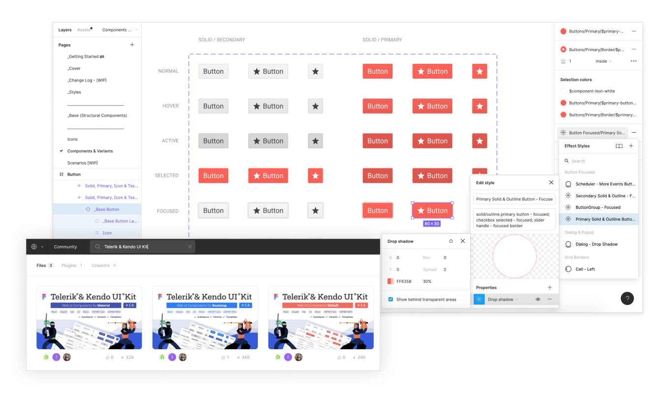
One is the Telerik and Kendo UI kits for Figma. If you don’t know Figma, now is the best time to check it out. They have been smashing the design world lately. Our UI kits are essentially Telerik and Kendo UI web components made for the designer. They are available in our three themes: the Default, and the ones based on Bootstrap and Material Design.
Each kit consists of components and building blocks, perfectly matching the corresponding development web components. They are made with all states and variations and enable designers to use them in different application scenarios. This means that when designers use these kits, the designs that are coming your way will be created using the same components you use. You can finally speak the same language as your design counterpart from the get-go.
The kits are built with the best design practices in mind. All styles are exposed, as well as descriptions of the usage and design tokens. Design tokens are the parameters needed to easily construct and maintain a design system—colors, typography, effects, etc.
In Figma, a design token is represented as a named style. This architecture allows you to propagate global changes. By using design tokens, instead of hard-coded values, the design system will be flexible, consistent and maintainable. Simply put, a change of a value under a token will propagate to every single instance in the UI kit where this token has been used, saving you tons of time.

You can find the Telerik and Kendo UI kits on the Progress page of the Figma Community. They are applicable for:
- KendoReact
- Kendo UI for Angular
- Kendo UI for Vue
- Kendo UI for jQuery
- Telerik UI for Blazor
- Telerik UI for ASP.NET Core
- Telerik UI for ASP.NET MVC
Meet Unite UX
Having out-of-the-box matching components between designers and developers is pretty cool, no? But again—why stop here?
We know many of you customize our components’ look and feel to make your design system or brand guide unique. But let’s admit it, this can be a hefty task: a lot of code meddling, back and forth with the designer and pixel pushing. That is no more. You can be freed from this mundane task and move to more meaningful ways to create value for your customers and build products they’ll love.
Unite UX is here to help that come true. Unite UX is our design-to-development UI component styles builder. What does that mean? Unite UX helps you apply styles coming from the design on top of the Kendo UI and Telerik components in a completely visual way.
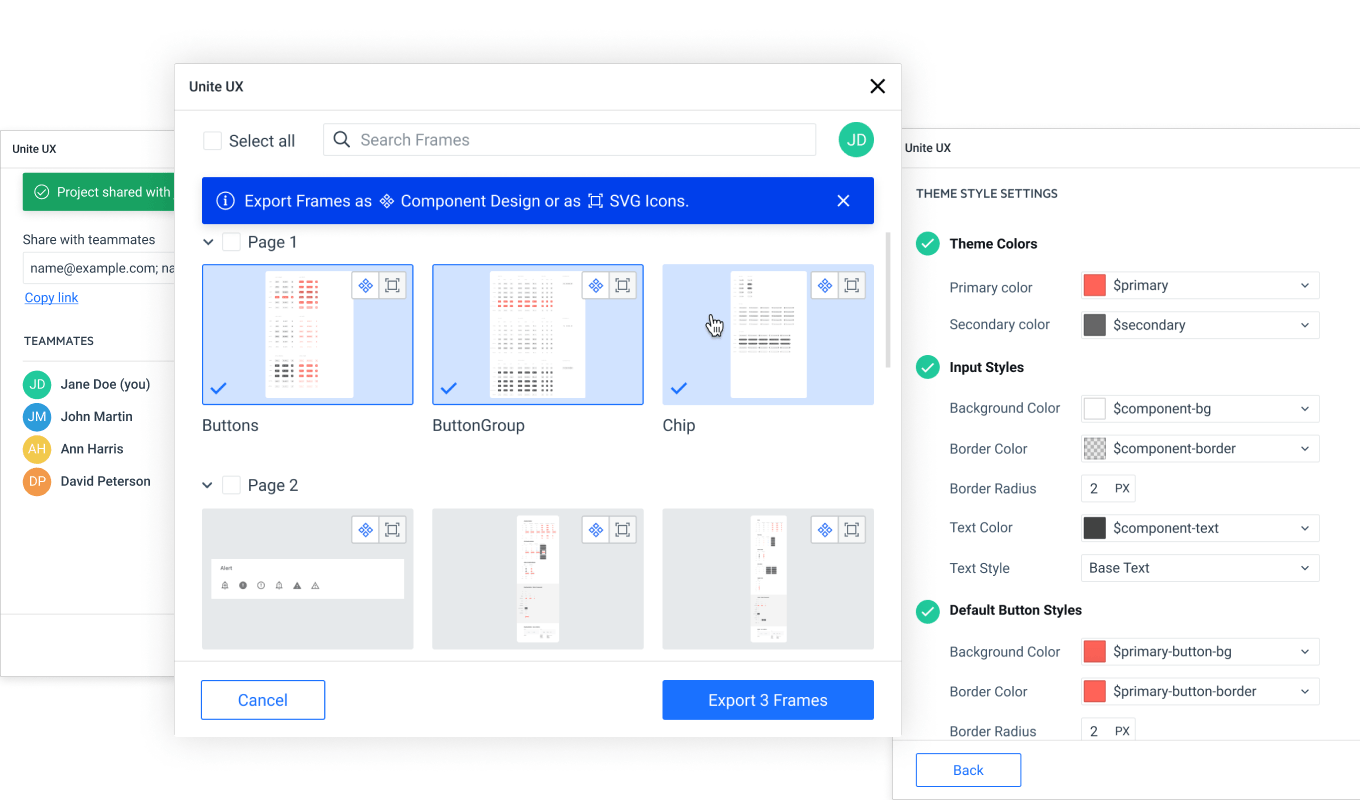
On the design side, we integrate with Figma via the Unite UX plugin, where we enable designers to export the ready UI kit and hand off to the developers. You can kickstart with the Telerik and Kendo UI kits for Figma or from your own file.

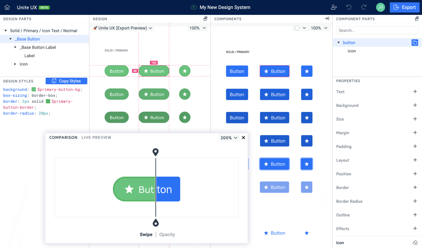
Then, in the Unite UX cloud-based application, developers get the exported design and with the help of some smart tools apply them on top of the components. Unite UX is completely visual: you can compare side-by-side the design and coded component until you make them 100% identical.
Also, remember the design tokens we mentioned earlier—in Unite UX you can pair them with Sass variables. This means that if a value under a token is changed on the design side and exported via the Unite UX plugin, this change will be applied automatically on the dev components. No pain, yes gain. Also, no code. We generate the ready-to-use frontend of your UI library that you only need to apply on top of your application to make it shine with your desired look.

In addition, we also generate custom documentation for your UI library in Storybook—filled with demos, code snippets, installation guides and more. You now have a central hub for all components your dev team should use in the application-building process. A winning setup—easy to collaborate, scale and maintain.
Unite UX is now freshly out for public beta. You can check it out and purchase with a 20% discount during that limited period.

Antoniya Boynovska
Antoniya Boynovska is a Product Manager at Progress. She is part of the Innovation team, which is focused on validating and creating new products. Antoniya has more than 10 years of experience as a digital professional. She is passionate about making ideas happen in the crossroad between technology, business and strategy. She has experience in both startups and mature companies. Antoniya is also interested in politics, behavioral economy, art history and urbanism, and is curious about new stuff.
