


Displaying data in tables is a lasting requirement of user interfaces. React Table is described as an “almost headless” table library for React. It focuses on giving you all the data aspects in a convenient format and leaves the styling and componentizing to you. This approach makes it easy to build powerful data grids and style them as needed. In this article, we'll use the react-table library to build a table with styling, filtering, sorting, and paging.
What is react-table?
The most recent version of the react-table library is part of TanStack, a larger project that provides components in a framework-agnostic way. Accordingly, react-table can drive table components for several frameworks: React, Solid, Vue, Svelte and applications built using TypeScript or JavaScript. Our examples focus on building a table in React.
To provide data for the table, we’re going to use a localhost endpoint that provides cryptocurrency data, including the timestamp, price, volume, and market cap for various currencies. For example, a row’s data will look like Listing 1.
Listing 1. A row of cryptocurrency data
{ cryptocurrency: 'solana',
  timestamp: 1586563521174,
  price: 0.9576058280146803,
  volume: 92672667.43447028,
  marketCap: 7827651.892659198 }
The endpoint we're using is localhost:3001/crypto-data.
To create a new project, use npx create-react-app iw-react-table. (This instruction assumes you have Node/NPM installed.) Then, you can cd into the new /iw-react-table directory.
We'll start with a simple table to display this data, by creating a new component in src/CryptoTable.js, with the content of Listing 2.
Listing 2. A simple table built using react-table
import React, { useState, useEffect, useMemo } from 'react';
import { useTable } from 'react-table';

const CryptoTable = () => {
  const [data, setData] = useState([]);
  const [loading, setLoading] = useState(true);

  useEffect(() => {
fetch("http://35.188.145.46:3001/crypto-data")
      .then((response) => response.json())
      .then((data) => {
        setData(data);
        setLoading(false);
      })
      .catch((error) => {
        console.error('Error fetching data:', error);
        setLoading(false);
      });
  }, []);

  // Define columns for the table
  const rawColumns = [
    { Header: 'Timestamp', accessor: 'timestamp', },
    { Header: 'Cryptocurrency', accessor: 'cryptocurrency', },
    { Header: 'Price', accessor: 'price', },
    { Header: 'Volume', accessor: 'volume', },
    { Header: 'Market Cap', accessor: 'marketcap',
    },
  ];
  const columns = useMemo(() => rawColumns, []);

  // Create a table instance
  const {
    getTableProps,
    getTableBodyProps,
    headerGroups,
    rows,
    prepareRow,
  } = useTable({
    columns,
    data,
  });

  if (loading) {
    return <div>Loading...</div>;
  }

  return (
    <table {...getTableProps()} className="crypto-table">
      <thead>
        {headerGroups.map(headerGroup => (
          <tr {...headerGroup.getHeaderGroupProps()}>
            {headerGroup.headers.map(column => (
              <th {...column.getHeaderProps()}>{column.render('Header')}</th>
            ))}
          </tr>
        ))}
      </thead>
      <tbody {...getTableBodyProps()}>
        {rows.map(row => {
          prepareRow(row);
          return (
            <tr {...row.getRowProps()}>
              {row.cells.map(cell => {
                return (
                  <td {...cell.getCellProps()}>{cell.render('Cell')}</td>
                );
              })}
            </tr>
          );
        })}
      </tbody>
    </table>
  );
};

export default CryptoTable;
Some of this is typical React: We create two state variables with useState: data to hold the data itself, and loading to control the display of the loading text. We call useEffect to make the back-end call with fetch.
Then, we create the columns for the table. The basic column setup requires the “Header” and the “accessor,” which are the label for the column and the key that is used to access the field on the row objects. After that, we call the useMemo hook on the columns (learn more about useMemo here). Memoizing prevents re-executing the accessor calls for each row. Without memoizing, React might perceive that the application had gone into an infinite loop when loading large data sets.
Next, we create the table with the useTable hook, which comes from react-table. This hook accepts the columns definition and the data itself. With that, it has enough information to build a grid. The useTable hook returns an object with all the properties required for configuring the table markup. These are destructured into their component methods and props, like getTableProps and getTableBodyProps, which we then use in the markup. This is fairly straightforward, although you’ll notice we actually use the row and column arrays in JSX to render the th, tr, and td elements.
This is where we start to be more involved in the actual table construction than we would with a more component-oriented library. However, you can see it’s not that complex and we gain hands-on access to the table internals. This fine-grained control could come in very handy when it comes to edge-case customizations.
The results of our current code will give us a view like what is shown in Figure 1. (Notice that it's a good time to buy some BTC cryptocurrency.)
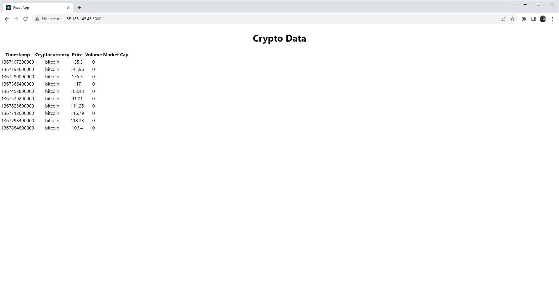 IDG
IDG
Figure 1. A basic table built with React and react-table.
Run the application
To use the new CryptoTable component, you can update your src/App.js to look like Listing 3.
Listing 3. Use the component
import React from 'react';
import './App.css';
import CryptoTable from './CryptoTable1';

function App() {
  return (
    <div className="App">
      <h1>Crypto Data</h1>
      <CryptoTable />
    </div>
  );
}

export default App;
Run the app with: $ /iw-react-table/npm start. Visit localhost:3000 to check the results.
Styling
Now, let’s add some styling. Modern CSS makes it easy to go from the primitive look of Figure 1 to something decent. Listing 4 shows some simple table styling.
Listing 4. Table styles
crypto-table {
  width: 100%;
}
.crypto-table th,
.crypto-table td {
  border: 1px solid black;
  padding: 5px;
}
.crypto-table th {
  background-color: #eee;
}
.crypto-table {
  border-collapse: collapse;
  border: 1px solid #ccc;
  font-family: sans-serif;
  font-size: 14px;
}
.crypto-table th,
.crypto-table td {
  border: 1px solid #ccc;
  padding: 10px;
}
.crypto-table th {
  background-color: #eee;
  text-align: left;
}
.crypto-table td {
  text-align: right;
}
.crypto-table tr:nth-child(even) {
  background-color: #f9f9f9;
}
.crypto-table tr:hover {
  background-color: #ddd;
}
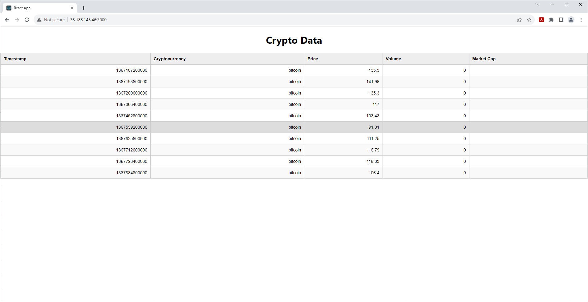
This will give us a look like the table in Figure 2.
 IDG
IDG
Figure 2. A basic React table with some style.
Client-side sort
Now let's add sorting functionality that react-table will handle for us in memory. In our case, we ultimately want server-side sorting, but this example lets you see how easy it is to do client-side sorting. To add client-side sorting, follow these steps:
- Import
useSortfromreact-table - Add it to the table like so:
useTable({ columns, data }, useSortBy); - Modify the table header markup as shown in Listing 5.
Listing 5. Sortable table header
<thead>
  {headerGroups.map(headerGroup => (
    <tr {...headerGroup.getHeaderGroupProps()}>
      {headerGroup.headers.map(column => (
        <th {...column.getHeaderProps(column.getSortByToggleProps())}>
          {column.render('Header')}
          <span>
            {column.isSorted ? (column.isSortedDesc ? ' 🔽' : ' 🔼') : ''}
          </span>
        </th>
      ))}
    </tr>
  ))}
</thead>
Now when you click a header, it’ll sort on that column and display the appropriate icon.
Server-side sort
For the next step, let's make the sort use the back end. Our API accepts sortBy and sortOrder parameters in the URL, so the first step is to add sortBy and sortOrder state hooks. (Remember to remove the client-side sorting.) Then, use those variables in the URL like so.
fetch(`http://localhost:3001/crypto-data?sortBy=${sortBy}&sortOrder=${sortOrder}`)
Also, we need to set the sortBy and sortOrder as dependent variables in the useEffect that fetches the data. Do this by adding them to the array in the second argument to useEffect.
Now, add a function to handle the action when the user clicks on a header, as shown in Listing 6. (I skipped the header icon here for brevity.)
Listing 6. Sort-click handler
const handleSortClick = (column) => {
  if (column.sortable) {
    // Determine the new sort order
    const newSortOrder = sortBy === column.id && sortOrder === 'asc' ? 'desc' : 'asc';
    setSortBy(column.id);
    setSortOrder(newSortOrder);
  }
};
To handle the click, you can add the following event handler to the <th> element: onClick={() => handleSortClick(column)}. Notice that we check column.sortable, which we can set on the columns when we create them, for example:
{ Header: 'Timestamp', accessor: 'timestamp', sortBy: 'timestamp', sortable: true }
Now whenever you click the header, the table will reload with the appropriate column sorted by the backend.
Filtering
We can use a similar process to handle filtering. Let’s say we want to filter on cryptocurrency. We can add a drop-down menu and apply it to the URL via a state variable (selectedCrypto). Now the fetch call will look like so:
fetch(`http://35.188.145.46:3001/crypto-data?sortBy=${sortBy}&sortOrder=${sortOrder}&cryptoCurrency=${selectedCrypto}`)
Remember to add selectedCrypto to the list of dependent variables for useEffect.
We can add a drop-down as shown in Listing 7.
Listing 7. Crypto menu
<select value={selectedCrypto} onChange={handleCryptoChange}>
  <option value="bitcoin">Bitcoin</option>
  <option value="ethereum">Ethereum</option>
  <option value="solana">Solana</option>
</select>
And all that remains is to handle the change event, as shown in Listing 8.
Listing 8. Crypto change event handler
const handleCryptoChange = (event) => {
    setSelectedCrypto(event.target.value);
  };
Now, when the currency is selected, the table will re-render with that set in the URL.
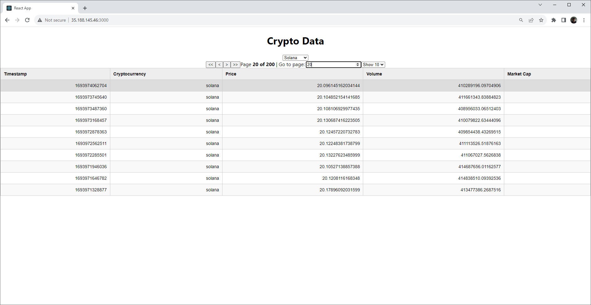
Paging
Paging can also be done on the client or the server. The process for paging on the server is very similar to sorting and filtering, so let’s see a client-side example. We’ll wind up with something like what's shown in Figure 3, with controls for moving forward and backward, setting the page size, and jumping to a page, along with a display of how many pages exist.
 IDG
IDG
Figure 3. Client-side paging with react-table.
To achieve this, we need to:
- Import the
usePaginationhook. - Use the new hook with the table instantiation, and expose the functions for controlling the paging.
The import command for the usePagination hook is: import { useTable, usePagination } from 'react-table';. Listing 9 shows the new hook and functions for controlling paging.
Listing 9. Table creation with paging
const {
    getTableProps, getTableBodyProps, headerGroups, page, // Get the current page of data
           // Add pagination functions and variables
    previousPage,
    nextPage,
    canPreviousPage,
    canNextPage,
    gotoPage, // Add gotoPage function
    pageCount, // Add pageCount variable
    pageOptions, // Add pageOptions variable
    setPageSize, // Add setPageSize function
    prepareRow, state: { pageIndex, pageSize }, // Current page index and page size
  } = useTable({
    columns,
    data,
    initialState: { pageIndex: 0, pageSize: 10 }, // Set the initial page index and page size
  },
    usePagination // Add the usePagination hook
  );
Add the markup that uses the controls, as shown in Listing 10.
Listing 10. Paging controls
<div className="pagination">
  <button onClick={() => gotoPage(0)} disabled={pageIndex === 0}> {'<<'} </button>
  <button onClick={() => previousPage()} disabled={!canPreviousPage}>{'<'}</button>
  <button onClick={() => nextPage()} disabled={!canNextPage}>{'>'}</button>
  <button onClick={() => gotoPage(pageCount - 1)} disabled={pageIndex === pageCount - 1}>
    {'>>'} </button>
  <span> Page{' '} <strong> {pageIndex + 1} of {pageOptions.length} </strong>{' '} </span>
  <span> | Go to page:{' '} <input type="number" defaultValue={pageIndex + 1} onChange={(e) => {
        const page = e.target.value ? Number(e.target.value) - 1 : 0;
        gotoPage(page);
      }} />
  </span>
  <select value={pageSize} onChange={(e) => { setPageSize(Number(e.target.value)); }} >
    {[10, 20, 30, 40, 50].map((pageSize) => (
      <option key={pageSize} value={pageSize}>
        Show {pageSize}
      </option>
    ))}
  </select>
</div>
Essentially, we build a form to interact with the page functions like gotoPage and canNextPage. If you try this out, you’ll notice that react-table is able to handle large datasets with good responsiveness.
Conclusion
This article has demonstrated some of the key features in react-table. There's a lot more the library can handle. For example, here’s how to do infinite scrolling with virtual tables, expandable rows, and more.
Although react-table is obviously well-thought out and capable, the most compelling thing about it is how easy it makes rendering and eventing; this means almost anything you need to do is possible without digging into React internals. It’s no surprise that this library is so popular, with over a million weekly downloads from NPM.
You'll find the full code for the examples in the repository for this article.