3 Ways to Select Dates in Vue.js Forms Using Kendo UI DateInput Component

In this post, we'll demonstrate three ways you can add date selection to your Vue.js application using Kendo UI. We explain the need for dates, its uses on modern web apps, and build a Vue.js application.
Dates are a major part of modern web development components. The uses are mostly demonstrated in schedulers, calendars, and forms where users are expected to select specific dates for a particular event to occur. In this post, we will demonstrate three ways you can render a date component in your Vuejs application using a Kendo UI Dateinput component.
Create a Vue Project
To get started building our project, we’ll need to first create a Vue project, install the Kendo UI packages we will need for the project, and finally create our activity form. Without further ado, open a terminal window on your preferred directory and run the command below:
$ vue create dateinput-demo
If you don’t have Vue CLI installed globally, please follow this guide to do so and come back to continue with this lesson afterward.
When you’re done bootstrapping your Vue application, change into the new Vue application directory and start the development server.
$ cd dateinput-demo
$ npm run serve
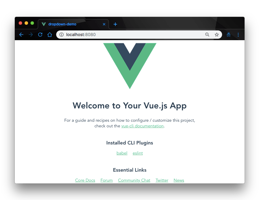
This will serve your Vue application on localhost:8080. Navigate to it on your browser and you will see your Vue application live.

Add Kendo UI to Project
Next, let’s add Kendo UI to our new Vue project. For the scope of this demonstration, we’ll need
- The Kendo UI package
- The Kendo UI default theme package
- The Kendo UI DateInout wrapper for Vue
To do that, open a terminal window in the project’s root directory and run the commands below:
// Install Kendo UI vue package
$ npm install --save @progress/kendo-ui
// Install Kendo UI dateinput wrapper for vue
$ npm install --save @progress/kendo-dateinputs-vue-wrapper
// Install Kendo UI default theme package
$ npm install --save @progress/kendo-theme-default
Finally, we add the necessary Kendo UI packages from the CDN service. Open the index.html file in the public directory and add this snippet within the <head> tag:
<!--Load Kendo styles from the Kendo CDN service-->
<link rel="stylesheet" href="https://kendo.cdn.telerik.com/2017.3.913/styles/kendo.common.min.css"/>
<link rel="stylesheet" href="https://kendo.cdn.telerik.com/2017.3.913/styles/kendo.default.min.css"/>

<!--Load the required libraries - jQuery, Kendo, and Vue-->
<script src="https://code.jquery.com/jquery-1.12.4.min.js"></script>
<script src="https://kendo.cdn.telerik.com/2017.3.913/js/kendo.all.min.js"></script>
<script src="https://unpkg.com/vue/dist/vue.min.js"></script>
Now that we have all the necessary Kendo UI packages in our project, let’s go ahead and build our Calendar.
1. Date Selection with Kendo UI DateInput Calendar Component
Generally, the DateInput components enable users to pick dates and times for different purposes, be it in filling forms, scheduling events, managing to-dos, etc. Here, we’ll demonstrate how to select dates in our Vue application using the Kendo UI DateInput Calendar component.
To do this, we’ll need to edit our just-created Vue app. Open the src/components/ folder, you should find an existing file HelloWorld.vue. Rename the file to DateInputs.vue and update it with the code below:
<!-- src/components/DateInputs.vue -->
<template>
  <div class="hello">
    <h3>{{ msg }}</h3>
    <div id="vueapp" class="vue-app">
      <div class="col-xs-12 col-sm-6 example-col">
        <div class="col-xs-12 col-sm-6 example-col">
          <p>Select dates from the calendar below</p>
          <kendo-calendar v-on:navigate="onNavigate"></kendo-calendar>
        </div>
      </div>
    </div>
  </div>
</template>
<script>
export default {
  name: "DateInputs",
  props: {
    msg: String
  },
  methods: {
    onNavigate: function(e) {
      var view = e.sender.view();
      console.log(view.name); //the name of the current view
      var current = e.sender.current();
      console.log(current); //currently the focused date
    }
  }
};
</script>
Here we have rendered the kendo-calendar widget on the template and implemented the onNavigate method to log our currently focused month and day when the function is executed. Next, let’s update our App.vue file with the code below:
<!-- src/App.vue -->
<template>
  <div id="app">
    <img alt="Vue logo" src="./assets/logo.png">
    <DateInputs msg="Date selection with Kendo ui DateInput Calendar component"/>
  </div>
</template>
<script>
import DateInputs from './components/DateInputs.vue'
export default {
  name: 'app',
  components: {
    DateInputs
  }
}
</script>
<style>
#app {
  font-family: 'Avenir', Helvetica, Arial, sans-serif;
  -webkit-font-smoothing: antialiased;
  -moz-osx-font-smoothing: grayscale;
  text-align: center;
  color: #2c3e50;
  margin-top: 60px;
}
</style>
Here we imported our DateInputs component and registered it to our Vue instance. Then we defined the msg prop to display our custom message. Finally, open the main.js file and update it with the code below:
<!-- src/main.js -->
import Vue from 'vue'
import App from './App.vue'
import { DateinputsInstaller } from '@progress/kendo-dateinputs-vue-wrapper'
Vue.use(DateinputsInstaller)
Vue.config.productionTip = false

new Vue({
  render: h => h(App),
}).$mount('#app')
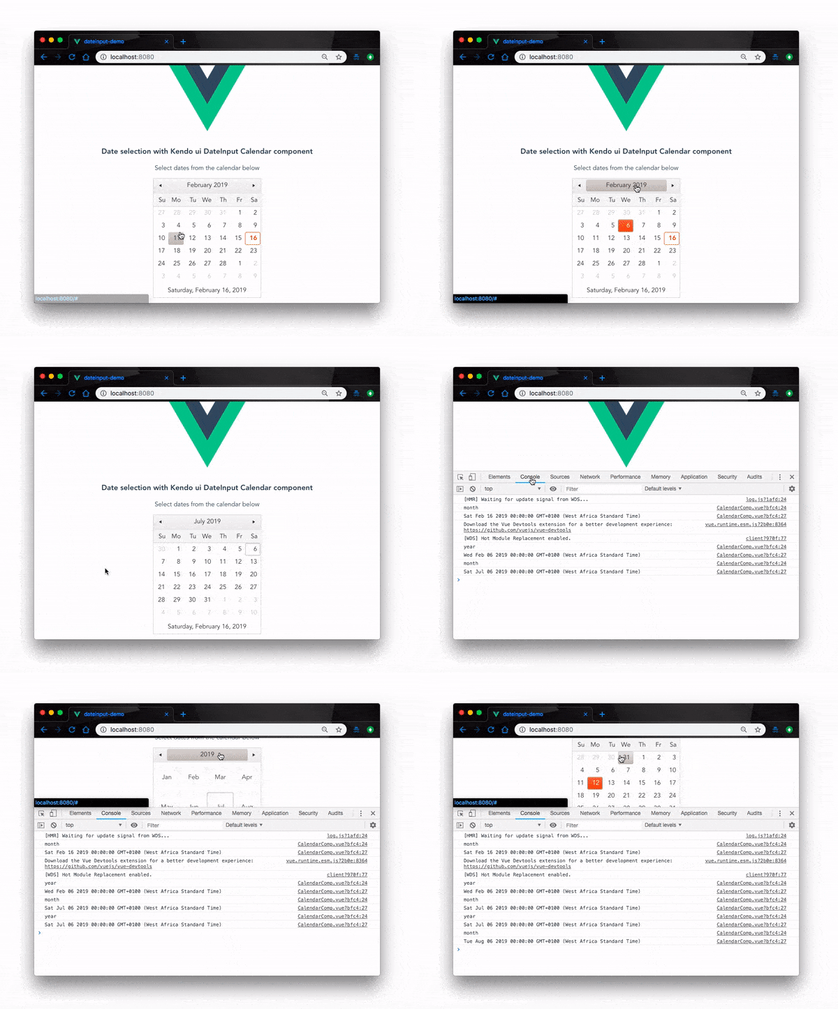
Here we imported the DateInputInstaller from our DateInput Vue wrapper and registered it to our Vue instance. Now when you check back on the browser where our project is running, you should see our calendar output:

Great! our DateInput calendar component works. This way, you can easily render calendars at different parts of your Vue applications whenever you need to.
2. Date Selection with Kendo UI DateInput DateInput Component
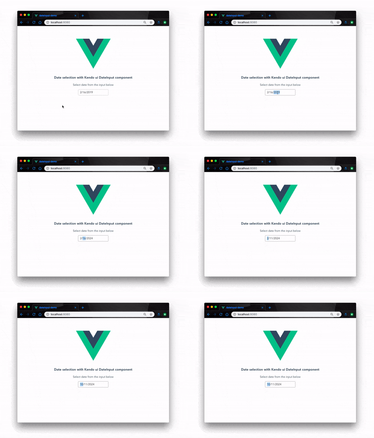
Unlike the Calendar component, the DateInput component represents an input field that recognizes and formats scheduling values such as dates. The input in each section of the DateInput widget is always valid for the relevant section. For instance, you cannot enter 23 in the month section or 60 in the day section. As a result, the value in DateInput is always any valid date.
To do this, we need to modify our existing Vue application to capture the new changes. First, open the DateInputs component we created in the last example and update it with the code below:
<!-- src/components/DateInputs.vue -->
<template>
  <div class="hello">
    <h3>{{ msg }}</h3>
    <div id="vueapp" class="vue-app">
      <div class="col-xs-12 col-sm-6 example-col">
        <div class="col-xs-12 col-sm-6 example-col">
          <p>Select date from the input below</p>
          <kendo-dateinput v-model="date"></kendo-dateinput>
        </div>
      </div>
    </div>
  </div>
</template>
<script>
export default {
  name: "DateInputs",
  props: {
    msg: String
  },
data() {
    return {
        date: null
    }
}
};
</script>
Here, we removed the <kendo-calendar> widget we used in the previous example and replaced it with the <kendo-dateinput> widget. We have also added a data() function to initialize our date variable in the widget. If you check back on the browser, our new <kendo-dateinput> widget will be live:

3. Date Selection with Kendo UI DateInput DatePicker Component
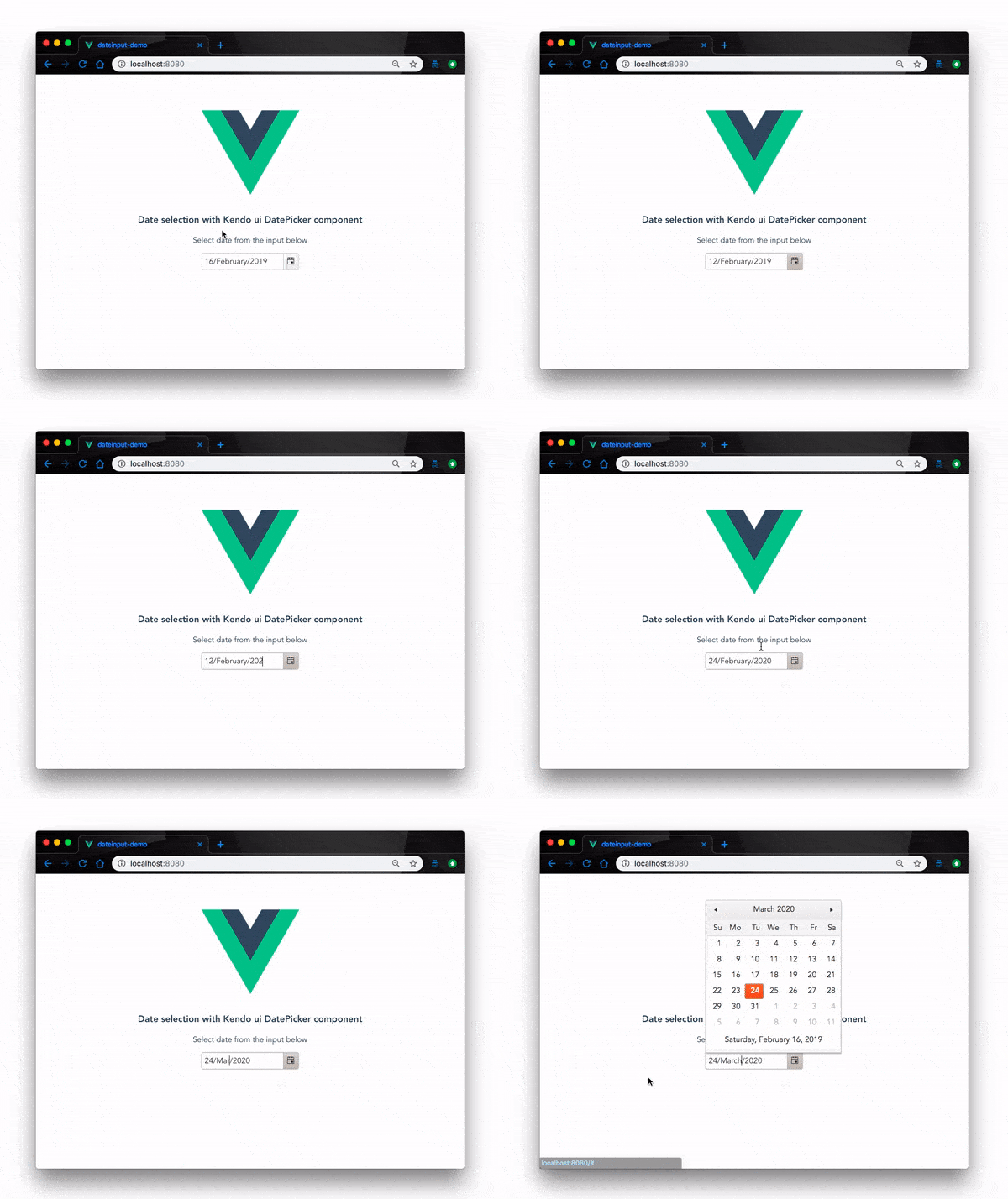
Last but not the least is the Kendo UI DatePicker component. It combines the Kendo UI DateInput and Calendar components, giving the user the ability to either enter or pick a date value.
To implement this, we’ll have to further modify our existing application and swap out the relevant parts for the new widget. Open the DateInputs.vue file and update it with the code below:
<!-- src/components/DateInputs.vue -->
<template>
  <div class="hello">
    <h3>{{ msg }}</h3>
    <div id="vueapp" class="vue-app">
      <div class="col-xs-12 col-sm-6 example-col">
        <div class="col-xs-12 col-sm-6 example-col">
          <p>Select date from the input below</p>
          <kendo-datepicker
            :min="minDate"
            :max="maxDate"
            :value="currentDate"
            :format="'dd/MMMM/yyyy'"
          ></kendo-datepicker>
        </div>
      </div>
    </div>
  </div>
</template>
<script>
export default {
  name: "DateInputs",
  props: {
    msg: String
  },
  data() {
    return {
      minDate: new Date(1, 9, 2010),
      maxDate: new Date(30, 10, 2050),
      currentDate: new Date()
    };
  }
};
</script>
Like before, we rendered the <kendo-datepicker> widget with the minimum and maximum date ranges. We also set the initial value of the date to the current date. Now if you check back on the browser, we’ll have the new widget rendered and functional:

Conclusion
In this post, we have demonstrated by examples three different way you can add date selection functionalities to your Vue.js application using Kendo UI. This is only the surface of what Kendo UI can do. With Kendo UI, you can add other UI components and handle complex user interface compositions. Feel free to look up the documentation for more.
This post has been brought to you by Kendo UI
Want to learn more about creating great web apps? It all starts out with Kendo UI - the complete UI component library that allows you to quickly build high-quality, responsive apps. It includes everything you need, from grids and charts to dropdowns and gauges.

Christian Nwamba
Chris Nwamba is a Senior Developer Advocate at AWS focusing on AWS Amplify. He is also a teacher with years of experience building products and communities.

