
In recent years we’ve seen a number of major shifts in the online experience, mostly coming from the proliferation of mobile devices. The evolution of the Web has taken us from single versions of a website, to desktop versus mobile versions, to responsive sites that adapt according to screen size, then to native mobile apps, which either recreate the desktop experience as a native app, or act as a gateway to the responsive version.
The latest iteration of all of this is the progressive web app (PWA). A PWA is a software platform that aims to combine the best of both the Web and the native experience for website/app users.
In this article on CSS and PWAs, we’re going to discuss a number of techniques that can be used when creating the CSS required for the development of PWAs.
What are PWAs?
There are three main features of a PWA. As you’ll see, what makes a web app progressive is the “fixing” of problems typically associated with web apps, by adopting some of the techniques used by native apps to resolve these issues.
Reliable. A PWA should reliably load like a native app (no matter the state of the network). This is contrary to a web page, which typically does not load if the device is disconnected from the network.
Fast. The performance of a PWA should be independent of such things as geography, network speed, load or other factors that are beyond the control of the end user.
Engaging. PWAs should mimic the native app’s immersive, full-screen experience without requiring the need of an app store, even supporting such features as push notifications.
There are other features PWA features, but for now, we’ll keep to the most important ones described above.
Google has been at the forefront of pushing these kind of apps, but the adoption of PWAs has been picking up with vendors and plenty of other companies on the Web helping the adoption and embracing the concept of PWAs.
The following are comments from Itai Sadan, CEO of Duda, who was present at Cloudfest 2018:
Progressive web apps represent the next great leap in the evolution of web design and online presence management … they take the best aspects of native apps, such as a feature-rich experience and the ability to be accessed offline, and incorporate them into responsive websites. This creates an incredible web experience for users without the need to download anything onto their device.
Anyone providing web design services to clients is going to want to offer PWAs because over time, just like with mobile and responsive web design, it will become the industry standard.
What is Required for Developing PWAs?
Developing a PWA is not different from developing a standard web application, and it may be possible to upgrade your existing codebase. Note that for deployment, HTTPS is a requirement, although you can do testing on the localhost. The requirements for an app to become a PWA are discussed below.
1. Create a Manifest File
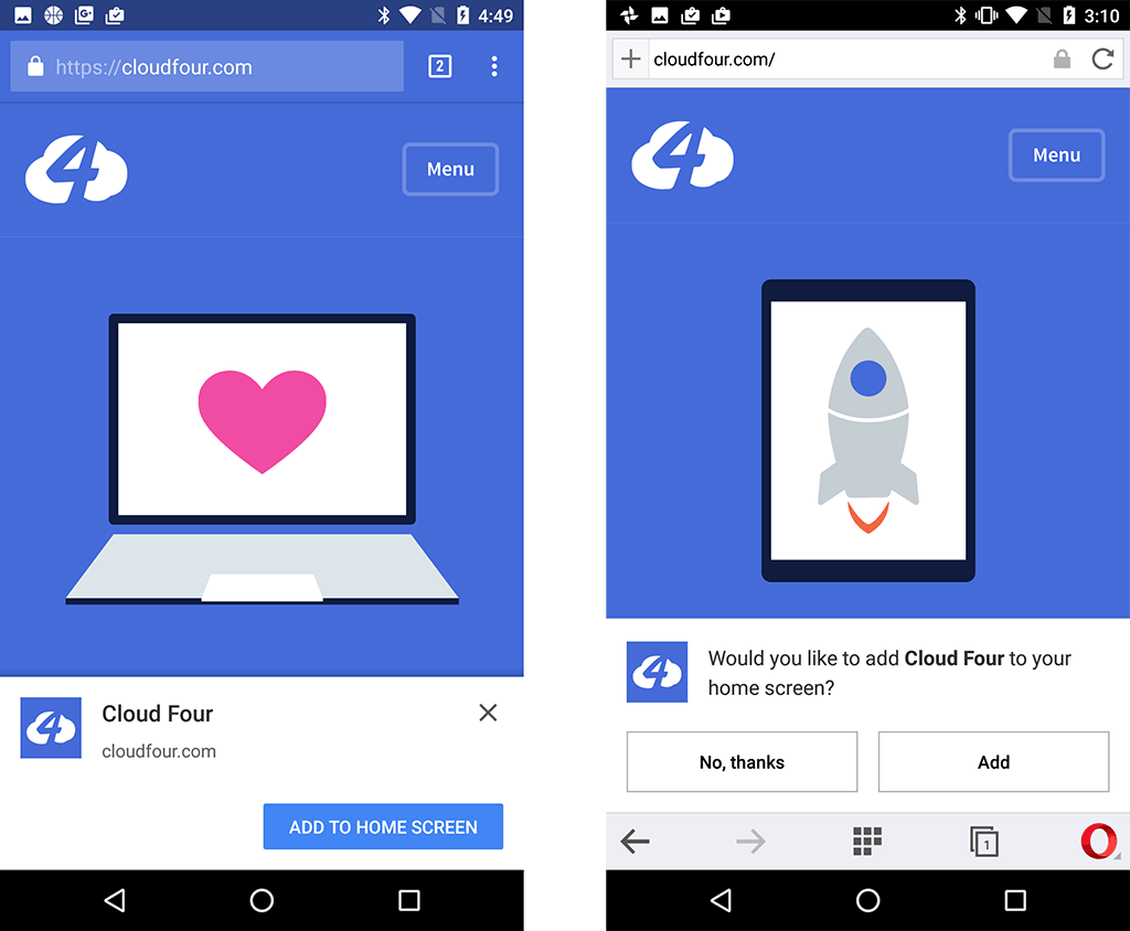
PWAs must be available to install directly via a website which has been visited, meaning there’s no need for a third-party app store to get the app installed.
To enable this, the app needs to provide a manifest.json file — a JSON file that allows the developer to control how the PWA appears, what needs to be launched and other parameters.
A typical manifest file appears below. As we can see, the properties are setting a number of look-and-feel settings that will be used on the home screen of the device where the app will be installed.
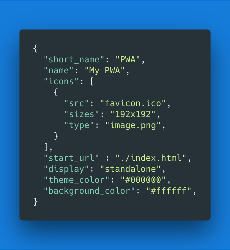
The styling of the PWA starts from the manifest file, but there’s no real CSS involved in this part. It’s just straight up properties, which define the application’s name, icons, primary colors, etc.
2. Using a Service Worker
A service worker is essentially a specific type of web worker, implemented as a JavaScript file that runs independently of the browser — such that it’s able to intercept network requests, caching or retrieving resources from the cache, and delivering push messages as necessary.
The service worker is what makes the PWA truly offline capable.
3. Install the Site Assets, Including CSS
The first time the Service worker is registered, an install event is triggered. This is where all of the site assets are installed, including any CSS, JS and other media and resource files required by the application:
self.addEventListener('install', function(e) {
e.waitUntil(
  caches.open('airhorner').then(function(cache)
  {
    return cache.addAll([
    '/',
    '/index.html',
    '/index.html?homescreen=1',
    '/?homescreen=1',
    '/styles/main.css',
    '/scripts/main.min.js',
    '/sounds/airhorn.mp3'
    ]);
  })
);
});
Developing PWAs is not very different from developing web apps, as long as the fundamental requirements have been met.
This is where the CSS starts to get involved, with the files defined that will be used to style the progressive web app.
CSS and PWAs: Some Considerations
When considering CSS and PWAs, there are things we need to keep in mind. All of these are decisions that need to be taken before the development of a progressive web app starts.
Should the App Follow Platform-specific UIs?
If we opt for one platform in favor of another (let’s say Android in favor of iOS) we risk alienating or putting at a disadvantage that part of the audience we didn’t consider.
We’re also tying our fortunes to that platform — whether good fortunes or bad ones. It’s also quite likely that platform designs change as they evolve between different versions.
My opinion is that vendor tie-in should be avoided as much as possible.
Platform-agnostic Design
Based on our previous consideration, the ideal is to opt for a mostly platform-neutral design.
If this path is chosen, we should ensure that the result doesn’t stray too much in form and function from the UI that the native platform exposes.
One needs to use standard behaviors and perform-extensive user testing to ensure no UX problems have been introduced on specific platforms. As an example, it’s highly recommended to avoid custom-written components and opt for standard HTML5 controls, which the browser can optimize for the UI and best experience.
Device Capabilities
The way forward for PWAs — even if at this point they’re mostly focused on devices — is to become a holistic solution for all platforms, including desktops. As of May 2018, Chrome supports PWAs on desktops, and other vendors will soon be supporting this too.
Your CSS and styling considerations need to factor all of this and design for this from the get-go.
The beauty of working with a PWA, though, is that you can use a combination of CSS and the Service Worker implementation to enhance or limit the functionality based on the resources available.
Graceful Degradation and Progressive Enhancement
CSS in general is able to fall back gracefully; any unsupported properties are simply ignored.
Having said that, one also needs to make sure that critical elements have the right fallbacks, or are not missing any essential styling.
An alternative approach to graceful degradation is progressive enhancement. This is a concept that we should always keep in mind when working on our PWA. For example, we should test first for the support of a Service Worker API before we attempt to use it, using code similar to this:
if (!('serviceWorker' in navigator)) {
  console.log('Service Worker not supported');
  return;
}
Variations of this logic can be used to handle different use cases, such as the styling for specific platforms, and others that we’ll mention later on.
General Suggestions
Although PWAs have a number of advantages when it comes to the user experience, they shift a lot of responsibility back to the developer when it comes to dealing with the nuances of different technology.
Speaking as a developer/Product Manager, who understands the delicate balance between user needs and the limited availability of development resources, I would always recommend finding a middle ground that covers as many use cases as possible, without putting too much overhead on the development and testing teams.
The emergence of design standards such as Material Design, and frameworks such as Bootstrap, helps to establish platform-agnostic designs.
The actual framework used is typically able to address devices of different capabilities, while the design school provides a homogeneous look and feel across platforms, allowing the developer to focus on the App’s features and functions.
If, on the other hand, you’d rather go down the whole separate look and feel, you’ll be able to use your service worker to be able to do this.
JavaScript provides a number of functions that can help to take decisions based on the platform and capabilities available. You can, therefore, use your code to test for the platform and then apply a stylesheet accordingly.
For example, the navigator.platform method returns the platform on which the app is running, while the navigator.userAgent returns the browser being used.
The browser agent is unreliable when it comes to detecting the browser, so the code below is more of a demonstration of a concept rather than code that should be used in a live environment.
The navigator.platform is a more reliable method, but the sheer number of platforms available makes it cumbersome to use in our example.
/**
* Determine the mobile operating system.
* This function returns one of 'iOS', 'Android', 'Windows Phone', or 'unknown'.
*
* @returns {String}
*/

function getMobileOperatingSystem()
{
  var userAgent = navigator.userAgent || navigator.vendor || window.opera;
  // Windows Phone must come first because its UA also contains "Android"
  if (/windows phone/i.test(userAgent))
  {
    return  "Windows Phone";
  }

  if (/android/i.test(userAgent))
  {
    return  "Android";
  }

  if (/iPad|iPhone|iPod/.test(userAgent) && !window.MSStream)
  {
    return  "iOS";
  }

  return  "unknown";
  // return “Android” - one should either handle the unknown or fallback to a specific platform, let’s say Android
}
Using the return value of getMobileOperatingSystem() above, you can then register a specific CSS file accordingly.
From the code above, we can see that such logic can get very convoluted and difficult to maintain, so I would only recommend using it in situations where a platform-agnostic design is not suitable.
Another option is to use a simpler color scheme, only CSS applied to the primary styles that matche the underlying OS, though this could still “break” in the case where users have skinned their device.
PWA Frameworks
When learning how to develop a PWA, it’s great to create everything manually: it’s an excellent way of learning all the fundamentals concepts of building progressive web apps.
Once you’ve become familiar with all the important aspects, you might then start using a few tools to help you out, increasing your development efficiency.
As with most development scenarios, frameworks are available to make development of PWAs faster and more efficient.
Each of these frameworks uses specific CSS techniques to ensure that the development process is maintainable, scalable and achieves the needs of both the developer and the end user.
By using such frameworks, you can ensure that your PWA works nicely on most devices and platforms, because the frameworks usually have cross-platform capabilities, although they may offer limited backward compatibility. This is another of those decisions you’ll need to take when deciding what you’ll be using to develop your progressive web app. By using frameworks, you cede some of the control you’d have if writing everything from scratch.
Below we’ll suggest a number of frameworks/tools that can be used to aid development of PWAs.
A word of advice, though: frameworks add a lot of overhead when it comes to performance.
We recommend that you only use these resources when starting out, eventually opting out of using them and going for minimalistic, lean stylesheets, using a platform-agnostic design.
1. Create React App

React has all of the components in place to allow the development of a PWA, by using such libraries as the Create React App.
This is a great example of creating a React PWA with this library.
2. Angular

Given that Angular is a product of Google and how we’ve seen the company pushing for PWAs, it’s no surprise that Angular has full support for PWAs.
If you’re used to working with Angular, you could consider using this as your framework of choice.
Angular 2+ supports the implementation of PWA features (such as service workers and manifest files) natively through the framework using the following commands:
ng add @angular/pwa --project project_name
This is a great article which guides you through creating a PWA with Angular.
Ionic

Ionic is another framework for PWAs. The framework
- leverages Angular to enable the creation of native apps using web technologies
- uses Cordova to run the app on devices such as phones
- has a built-in service worker and manifest support.
This is a premium framework that includes a number of developer-oriented and team-oriented features such as rapid prototyping, to make development faster.
PWAs and Performance
One of the fundamentals of progressive web apps remains that of a fast and engaging user experience.
For this reason, when considering the CSS, one needs to ensure to keep things as lean and minimalistic as possible.
This is one of the aspects where frameworks start to suffer. They add extra CSS resources that you’re not using, which can reduce performance in PWAs.
A number of considerations you might want to keep in mind:
- use HTTP/2 on your server
- use such hints as
rel=preloadto allow early fetching of critical CSS and other resources - use the NetworkInformationAPI and a caching implementation to access cached resources rather than downloading them
- inline critical CSS directly into the HTML document to optimize performance — which typically should be done for anything above the fold
- keep resources as lean and as small as possible
- minify all of your CSS resources and implement other optimizations such as compressing resources, optimizing images and use optimized image and video formats.
The Google guidelines on performance have other details you should keep in mind.
Google Lighthouse
Speaking of performance, the Google Lighthouse is a performance monitoring tool centered specifically around increasing performance, both of websites and progressive web apps.

Lighthouse, which used to be a plugin for Chrome, is today built-in with the Chrome Developer tools. It can be used to run tests against the progressive web app. The test generates a report which has plenty of detail to help you keep your development within the performance parameters of a PWA.
Wrapping Up
Using CSS and PWAs together has a few differences from using CSS to develop your web application or website (particularly in terms of performance and responsiveness). However, most techniques that can be used with web development can be suitably adopted for development of progressive web apps. Whether you use frameworks or build everything from scratch, weigh the benefits against the disadvantages, take an informed decision and then stick with it.
Frequently Asked Questions (FAQs) about PWA and CSS Considerations
What are the key CSS considerations when developing a Progressive Web App (PWA)?
When developing a PWA, it’s crucial to consider the CSS layout and design. This includes ensuring your app is responsive and works well on different screen sizes, from mobile devices to desktop computers. You should also consider the performance of your CSS, as this can significantly impact the speed and usability of your PWA. Using efficient selectors, minimizing the use of expensive properties, and reducing the complexity of your CSS can all help to improve performance.
How can I make my PWA responsive using CSS?
To make your PWA responsive, you can use CSS media queries to apply different styles for different devices based on screen size, resolution, and orientation. You can also use flexible layouts with CSS Flexbox or Grid, which allow your layout to adapt to the screen size and orientation. Additionally, using relative units like percentages or viewport units instead of fixed units like pixels can help to create a more flexible layout.
How can I improve the performance of my PWA with CSS?
There are several ways to improve the performance of your PWA with CSS. One is to minimize the use of expensive CSS properties, such as box shadows or gradients, which can slow down rendering. Another is to use efficient selectors, which can reduce the time it takes for the browser to match selectors to elements. You can also reduce the complexity of your CSS by avoiding unnecessary nesting and keeping your stylesheets as small and simple as possible.
What is the best CSS framework for PWAs?
The best CSS framework for your PWA depends on your specific needs and preferences. Some popular choices include Bootstrap, Foundation, and Bulma, which offer pre-designed components and responsive grids to help speed up development. However, it’s also possible to build a PWA without a CSS framework, using native CSS features like Flexbox or Grid for layout and media queries for responsiveness.
How can I use CSS to create a native app-like experience in my PWA?
To create a native app-like experience in your PWA, you can use CSS to design a user interface that is intuitive and familiar to users. This includes using consistent styling and layout across different screens, providing clear visual feedback for user interactions, and designing for touch input on mobile devices. You can also use CSS animations and transitions to create smooth, engaging interactions.
How can I handle different screen orientations in my PWA with CSS?
You can handle different screen orientations in your PWA using CSS media queries. These allow you to apply different styles based on the orientation of the device, whether it’s portrait or landscape. For example, you might want to adjust the layout or sizing of elements when the device is in landscape mode to make better use of the wider screen.
How can I use CSS to improve the accessibility of my PWA?
Improving the accessibility of your PWA with CSS involves designing your app to be usable by as many people as possible, including those with disabilities. This includes using sufficient color contrast for text and interactive elements, providing clear focus styles for keyboard navigation, and using semantic HTML with appropriate ARIA roles and properties to ensure your app is accessible to screen readers.
How can I use CSS to optimize the loading performance of my PWA?
Optimizing the loading performance of your PWA with CSS involves minimizing the amount of CSS that needs to be loaded and rendered before your app is usable. This can be achieved by inlining critical CSS, deferring non-critical CSS, and minimizing the size of your CSS files through minification and compression. You can also use CSS containment to limit the area of the page that needs to be re-rendered when styles change.
How can I use CSS to create a dark mode for my PWA?
Creating a dark mode for your PWA involves using CSS to provide an alternative color scheme that reduces light emitted by the screen. This can be achieved using CSS custom properties (variables) to define your color scheme, and media queries to detect the user’s preferred color scheme and apply the dark mode styles when preferred.
How can I use CSS to create smooth transitions and animations in my PWA?
Creating smooth transitions and animations in your PWA involves using CSS transitions and animations to change properties over time. This can be used to create engaging interactions and feedback for user actions. However, it’s important to use these features judiciously, as excessive or poorly-performing animations can negatively impact the user experience and performance of your app.
 David Attard
David is an inquisitive web designer who frequently shares his tips and tricks at CollectiveRay . When he's not blogging about web design, something he's been into for the last 12 years, he's usually dreaming about his next big thing.